1. Prepare the Line Art
Step 1
I have a previously made comic page which is inked traditionally. To start I make a new document in Adobe Illustrator and import the artwork by going to File > Place…

Step 2
Since the file I imported is a png, I need to turn the line art into paths in Illustrator. First I will need to trace the artwork by pressing the Image Trace button in the top menu, which appears when I have the image selected.

Next I press the Expand button in the same top menu. The image has now turned into editable paths.

When tracing an image, the results depend a lot on the resolution. In the below example, the top image is a result of tracing with an image resolution of 72 dpi, while the one below has a resolution of 300 dpi. The more detailed you want it, the higher the resolution.

Step 3
I name the layer “LineArt” and select everything on it by pressing the round button to the right of it in the Layers panel.

Instead of the pure black, I choose a softer brown color for the line art, and then set the mode to Multiply in the Transparency panel.

Advertisement
2. Set the Flat Colors
Step 1
From here I pick out a bunch of eye-catching colors. This makes it easier to notice when I’ve missed a spot.
I turn each hue into a swatch and make sure to check the Global box before pressing OK. This is so that when I later adjust the colors, every object with the same color swatch will also change.

Step 2
I make sure I have the line art paths selected, and then choose the Live Paint Bucket from the side menu (shortcut is K on the keyboard).

Now I simply click to fill in all empty fields with different colors.

Step 3
In some instances, as with the detailed cobblestone, it might be easier to use the Pen Tool instead.

3. Pick the Correct Colors
Step 1
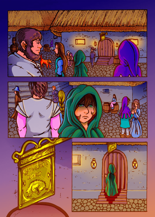
To help me pick suitable colors, I start setting the atmosphere with a gradient background. The comic will take place at night with the center character approaching the warm light from the tavern. I illustrate this by choosing a dark purple color, which becomes more orange the closer it gets to the tavern.
I name this layer Background and select Multiply from the Transparency panel.

Step 2
I adjust the colors by double-clicking each global process color and experiment a bit with the HSB sliders in the Color Mode.

Step 3
Lastly, I drag the Background layer on top of the others. Since the transparency is set to Multiply, the gradient will influence the colors a bit.

4. Add the Shadows
Step 1
To create the shadows, I start by making a new layer which I name Shadows. I set the transparency of the layer to Multiply, just like with the gradient background.
Using the same color swatch as the object I want to shade, I start hand drawing the shapes of the shadows with the Pencil Tool (N). Since this layer is set to Multiply, the color becomes a matching darker version.

Step 2
When I am done with the shadows of a particular color swatch, I go to the top menu and press the Select All button with Fill Color selected.


Step 3
Having all objects now selected, I turn the color of the objects into a radial gradient, going from 100% color to 0%. This makes the shadows softer.
Repeat this for each shadow color and adjust the gradients as you see fit.

5. Let There Be Light
Step 1
To make the lights in the scene, I make a new layer with transparency set to Soft Light.
For the lanterns I make a radial gradient with a warm yellow light. I repeat this light on the ground too, but a bit more faded.

Step 2
You can pull out some texture for objects with some highlighted details with the Pen Tool.

Step 3
With the Blob Brush I add some highlights to the roof.

I also add some rim light to the characters closest to the light source.

Step 4
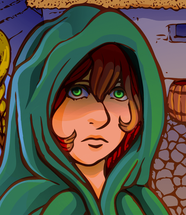
In the middle panel, the character is approaching the light source, so I add some wider fields of highlights to her cloak and hair using the Pen Tool.

6. That Little Extra Kick
Now that the whole page is starting to come along, I take some extra time to look for little things that can be improved.
Step 1
Going back to the Shadows layer, I make a darker shadow on her face by adding a blue radial gradient, contrasting with the yellow light.

Step 2
With the same gradient color I go to the Highlights layer, where I add highlights coming from a second light source, like moonlight.

I add the same kind of light in some other places, but keep the majority on the main character in the cloak.

Step 3
I want to add some extra shininess to the golden sign. Making a new layer with the Transparency set to Color Dodge, I select a light yellow color and use the Blob Brush to go over where I want some more shine.

On the same layer I add some of that shine to the irises of the character’s eyes as well.